One of the reasons the White Sox played two afternoon weekdays in a row to begin this week was they had a charity gala at the United Center Tuesday evening. I’d initially put this out of my mind until pictures of the Sox players dressed for a formal event began to fill up the White Sox Twitter feed last night. Since this is a baseball site, obviously the right thing to do is to grade the players’ sartorial games, using the familiar 20-80 scouting scale.
(Note that I couldn’t find any decent photos of Lucas Giolito, Tyler Saladino, Adam Engel, or Nicky Delmonico, all of whom were in attendance. From a low-quality wide shot, I’d rate them as good, poor, meh, and fair, respectively.)
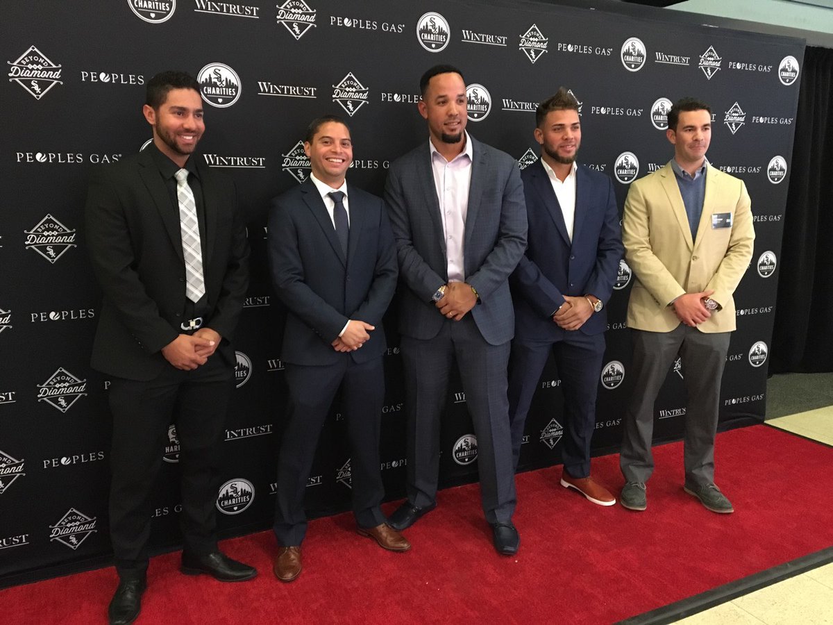
Squad goals. #CWSBeyondTheDiamond pic.twitter.com/WSeTROJQ1u
— Chicago White Sox (@whitesox) April 10, 2018
José Abreu
Suit-without-tie isn’t a high-ceiling look, as it plays it safe by reducing one’s opportunities for both flair and matching issues, but it plays up for athletes. Abreu does pretty well with it, though — he rocks the thinner lapels well, the suit fit is very good (though the break on the pants could be cleaned up a tad), and the shoes don’t take anything away from the outfit. I give him a small bump because, like me, he’s right-handed but wears his watch on the (atypical) right hand.
Style grade: 55
Yoan Moncada
Where Abreu took a subdued look and did almost everything right, Moncada makes some rookie mistakes with his outfit and looks generally ill-at-ease. The pants look wrinkled (?), those shoes don’t go with any suit, button-down collars are generally best avoided with suits, and he’s got both buttons of his jacket buttoned, which is to clothing fundamentals what Joakim Noah is to shooting fundamentals. On the bright side: he’s still young, the natural good looks are there, and maybe Abreu’s veteran mentorship will help him grow.
Style grade: 30
Joakim Soria, Miguel González and @hecsantiago53 all looking! #CWSBeyondTheDiamond pic.twitter.com/XHhQydcXn3
— Chicago White Sox (@whitesox) April 11, 2018
Joakim Soria
This isn’t a great photo to work with, but Soria’s look is pretty bland. I can’t quite tell the suit color (navy would be good, black would be bad) or shirt color (white good, gray bad). What I can tell is that the overall approach is less “gala” than “sales conference at the airport Hilton,” so while nothing’s horribly off, there’s nothing really right, either.
Style grade: 40
Miguel González
Same photo, same low quality. Migo’s pulled off a slightly more ostentatious version of Abreu’s look — bolder suit pattern, extra button undone, textured white shirt. From the photo I can’t fully judge the suit pattern (too bold and he’ll look like Jay Wright) or the shirt texture, but I’d grade him out as slightly better than Abreu, but in the same tier.
Style grade: 55
Hector Santiago
He cleans up nice! Santiago is one of the only guys around who throws a screwball, and probably not many would go for a suit like this. There are some nice details in here — the subtler shirt (possibly French cuffed? Photo is unclear) and tie play well with the suit, the peak lapels work, I’m a sucker for vests — but the core aspect is that he goes bold while still looking comfortable and totally uncontrived. If he pitches like he dresses, Carson Fulmer’s moving to the pen for sure.
Style grade: 70
The players and wives are looking amazing tonight for #CWSBeyondTheDiamond! @TimAnderson7 says he takes the prize for Best Dressed. pic.twitter.com/5lxsbmPYTT
— Chicago White Sox (@whitesox) April 10, 2018
Matt Davidson
The look is very “junior formal”; the jacket fit isn’t great, black shirts with ties should be approached with extreme trepidation, and both the suit and the tie are a bit too shiny. The loafers are the carrying tool here, for sure.
Style grade: 40
James Shields
90% of this is really strong. The brown shoes, while slightly too burnished, match the suit quite well; pocket squares are always the right decision; the lapel flower is a nice, playful touch. The suit is a nice color and fits well. That scarf, though, is just incredibly out of place. I can’t tell if Shields wore it all night — he’s clearly in some sort of coat check place, but it’s not a candid photo and his coat is nowhere to be seen. I think I’ll have to give two grades for this one.
Style grade (no scarf):
60 Style grade (with scarf): 50
Yolmer Sánchez
Yolmer takes a pretty standard route for a gala and does it some justice. There’s a reason tuxes are the go-to, and so he’s got a pretty high floor, but, with the exception of his lapel pin, he doesn’t nail any of the details — black tie isn’t the right time for loafers without socks, his jacket is just dying for a pocket square, that sleeve looks too long, notch lapels are never right for a tux, he’s wearing a plain white shirt. Easy stuff to fix, but still a lot to work on.
Style grade: 45
According to @jasonbenetti, tonight’s game show prize is @TimAnderson7’s jacket. #CWSBeyondTheDiamond pic.twitter.com/OXrrmAsHSR
— White Sox Charities (@soxcharities) April 11, 2018
Tim Anderson
I…don’t even know what to call that fabric. Technobrocade? It’s a very bold decision and could very easily have gone totally off the rails. It’s a testament to Timmy nailing seemingly every other detail in the outfit that I’m not particularly concerned about the very odd choice. The jacket fit is about perfect, the contrast shawl lapels were 100% the way to go, the studs in the shirt contrast very nicely, the short pants / no socks / loud loafers look fits the jacket vibe to a t, the puff of the handkerchief in the breast pocket is *chef kissing fingers*. He starts with a very bold jacket — that I don’t love — but gets the fit right and has enough sprezzatura to bring the whole thing home. Bravo, Tim! You get best-dressed.
Style grade: 70
Lead Photo via Chicago White Sox Twitter